
11 minute reading time; ~2120 words
Welcome and hello!
In this post, we’re going to touch on the overall lessons from the series so far, and then dive into delivering the ability to actually edit a template.
If you haven’t read the previous posts, I’d suggest you start at An App From Scratch: Part 1 – What To Build. You can also find all the related documents and code here: Building Tailgunner.
Some Housekeeping
In between the last post and this one, I made a few small changes to address some housekeeping notes from the work I’ve done.
Reflections / Lessons
So far in this series we’ve explored what it takes to get from an overall idea down to an actual functional user feature. Along the way, we talked about how to explore the idea, and break it down into smaller and smaller pieces, until we reached a point where an engineer can actually execute and deliver the functional product, incrementally building in a way that always left us with something we could use.
One of the biggest reflections I have is how much work is involved in both making a change and also breaking down the change and documenting every piece of it. It’s something I’d forgotten, because I’ve spent so much time over the last two years reasoning about the documentation part, freeing up the developers on my team to focus on building it.
Hopefully through this series so far, you’ve gained a new appreciation for the parts of the process that you didn’t know well, be it on the product design and planning side, or the building side of the fence. For every hour of code I’ve written, I’ve spent at least twice that time talking about it.
Expanding The Functionality
Now that we’ve completed the ability to add templates, we’re going to zoom out and tackle more of the workflows we previously identified for US1.
US1: Workflows
- Creating a template
Defining the metadata of a new template, including title. - Editing the template metadata
Changing the metadata for a template. - Editing the form fields in a template
Adding, editing, re-ordering, and deleting the fields in the form. - Editing the options of a form dropdown
Adding, editing, re-ordering, and deleting the options in a dropdown. - Saving changes to the template
Persisting all changes to a template. - Cloning a template
Duplicating a template, with a new name. - Deleting a template
Permanently removing a form template from the system.
This is a much larger piece of work in a single post, so I’m going to only dive into specific pieces of the work I’ve done.
Interesting Changes
Font Awesome Icons
I wanted to add some iconography to the site, so I installed FontAwesome, using their guide.
npm i --save @fortawesome/fontawesome-svg-core
npm i --save @fortawesome/free-regular-svg-icons
npm i --save @fortawesome/vue-fontawesome@latest-3
Since I’m not using a Kit (a pre-built collection of icons), I need to specify each icon that I want. We also need to add the library into our Inertia app as a component (line 20).
/* Set up Font Awesome */
import { library } from '@fortawesome/fontawesome-svg-core'
import { FontAwesomeIcon } from '@fortawesome/vue-fontawesome'
/* Import some regular style icons */
import { faTrashCan, faClone } from '@fortawesome/free-regular-svg-icons'
library.add(faTrashCan, faClone)
/* Import some solid style icons */
import { faSort, faPlus, faEye, faGripVertical, faTimes, faTriangleExclamation, faCircleCheck, faSpinner } from '@fortawesome/free-solid-svg-icons'
library.add(faSort, faPlus, faEye, faGripVertical, faTimes, faTriangleExclamation, faCircleCheck, faSpinner)
createInertiaApp({
title: (title) => `${title} - ${appName}`,
resolve: (name) => resolvePageComponent(`./Pages/${name}.vue`, import.meta.glob('./Pages/**/*.vue')),
setup({ el, App, props, plugin }) {
return createApp({ render: () => h(App, props) })
.use(plugin)
.use(ZiggyVue)
.component('font-awesome-icon', FontAwesomeIcon)
.mount(el);
},
progress: {
color: '#4B5563',
},
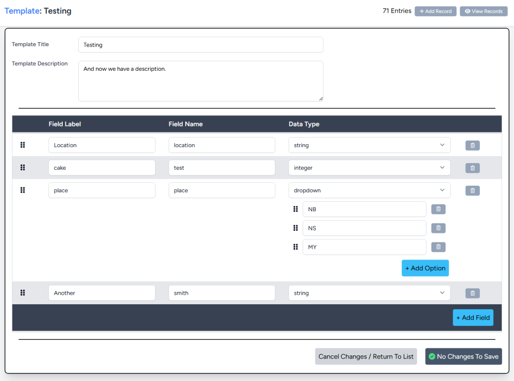
});Create Template Edit Page
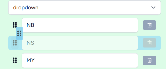
Drag To Organize
There are two things we need to sort: the fields in the template, and also the options in our dropdown / checkbox fields. Drag to organize is great, because the feedback is immediate and it’s easy to work with.
Building it was a bit of a challenge, because we’re sorting nested elements when we act on dropdown options, but here’s the final version.
First, we added a handle to grab, so we can attach the code to it.
<div :class="dragClasses.handle" draggable="true"
    @dragstart="fieldsDraggable.handleDragStart(index, $event)"
    @dragover.prevent="(e) => props.template.fields = fieldsDraggable.handleDragOver(index, props.template.fields, e)"
    @dragend="fieldsDraggable.handleDragEnd">
    <font-awesome-icon :icon="['fas', 'grip-vertical']" />
</div>
We’ve also got some code to handle the various actions related to dragging:
- Drag start (when we click and grab the handle)
- Drag over (when we move the handle over a different row)
- Drag end (when we let go of the handle)
There’s also a state function called isDragging that tells us if a specific field is being dragged, so we can add some CSS to partially fade the row, and highlight it, so we can see where we’re dragging it to.
Finally, all this code was extracted to a composable, which is a small piece of code that is intended to be reusable in multiple places, and tracks state (for example, the position of a mouse on a page). This composable also pulls in the CSS for the draggable elements, so it’s all in one place. This approach sets us up to be able to add draggable elements anywhere we want in Tailgunner!
import './useDraggable.css';

export function useDraggable(listId) {

    const handleDragStart = (index, event) => {};

    const handleDragOver = (index, items, event) => {};

    const handleDragEnd = () => {};

    const isDragging = (index) => {};

    // The css classes for the draggable
    const dragClasses = {};

    return {
        isDragging,
        handleDragStart,
        handleDragOver,
        handleDragEnd,
        dragClasses
    };
}
Making Sure We Save
The save button is built to serve as a good indicator of the template state. We’ve done this in a few ways:
- The text of the button tells you if there are no changes, if we’re saving, or to save.
- There’s also an icon to indicate the status.
- The button is disabled if there are no changes or we’re currently saving.
<script> <!-- Ignore this, just for the formatter -->

<button
    class="save_button"
    type="submit"
    @click="saveTemplate"
    :disabled="!isModified || isSaving"
>
    <span v-if="!isModified">
        <font-awesome-icon :icon="['fas', 'circle-check']" class="text-green-400" />
        No Changes To Save
    </span>
    <span v-else-if="isSaving">
        <font-awesome-icon :icon="['fas', 'spinner']" class="animate-spin" />
        Saving...
    </span>
    <span v-else>
        <font-awesome-icon :icon="['fas', 'triangle-exclamation']" class="text-yellow-400" />
        Save Template Changes
    </span>
</button>
Along with that, if there have been changes and the user clicks the “Cancel Changes / Return To List” button, they’re prompted to confirm they want to discard the changes.
Flash Messages
One useful UI element is something called a flash message. Intended for a short message that doesn’t need to be acknowledged, flash messages allow us to unobtrusively pop up a notification that something did or did not go wrong for the user. (If you were paying attention, we did a different style of flash message previously).
To solve this, I’ve built another composable, and a small template element for these messages. The template contains the styles as well as the HTML required to show the message. This template was registered in the AppLayout, so it’s available across the whole application.
Debounce
Debouncing is an optimization to reduce load on a system caused by rapid changes.
Here’s an example of what that actually means:
Imagine I ask you to list all the lights in your house and whether they’re on or off. Simple, right? Now, imagine I want you to update that list every time I flip a switch. That’s still manageable if I only flip one switch every few seconds. However, if I start flipping switches multiple times per second, it quickly becomes overwhelming to keep up.
Debounce is like saying, “It’s okay if the list isn’t updated instantly, as long as it’s accurate when I need it.” If I only check the list once a minute, you just need to note that a switch was flipped and update the list before I look again, which reduces your workload significantly.
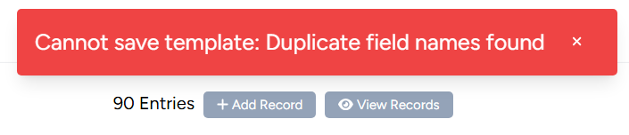
In the page, there’s a validation that checks to make sure that two fields don’t have the same name.
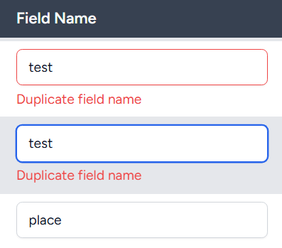
This check watches the field names, and since they update every time someone types a character, the check would run very frequently. I’ve applied a debounce to this code, so that it will only check at most once every 100ms.
const debouncedValidateFieldNames = debounce(validateFieldNames, 100);

// Watch for field name changes
watch(() => props.template.fields, () => {
    debouncedValidateFieldNames();
}, { deep: true });
This means that the page still feels responsive, because it’s not a lot of time in between checks, but also doesn’t lag our browser if we type fast. The more fields we have in our template, the bigger the impact of this debounce is, because it would take longer and longer to check.
No Spaces In Field Names
Since field names are the programmatic name we want to attach to pieces of data, they need to make sense, and one of the requirements is names should not contain spaces. We could have handled this by displaying an error on the field, or when saving, to tell a user to remove the spaces, but I had a better idea.
As the user types, we are running debounced validation to check if we’re duplicating the name. The other thing I’ve added is an automatic replacement of spaces with underscores, so as a user types in a field name, when they hit space, it’s immediately replaced.
const handleFieldNameInput = (field) => {
    // Replace spaces with underscores
    field.name = field.name.replace(/\s+/g, '_');
    debouncedValidateFieldNames();
};
Manual Testing
I’ve not wired up an automated testing suite for the UI actions, but the first step is always knowing what in the UI I want to test. As part of either planning, or during development, a list of test cases will start to emerge. They may be written down, or may just be in a developer’s head (and really should be written down if it’s more than just you 😆), but they always exist.
Here’s a list of all the things that we can and should test on this one page (22 that I could think of). The goal of testing is to make sure every button does something, the whole interface works, and we check both the happy path, and at least some of the unhappy path (errors, validation issues).
Template Level Actions
- Can the user create a new template
- Can the user change the template title
- Can the user change the template description
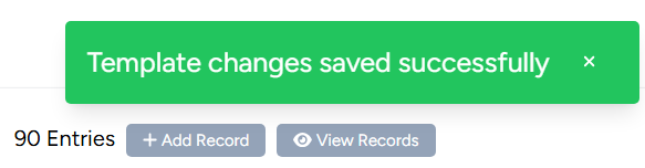
- Can the user save the template changes
- Do the changes persist when saving, and reloading the page
- Can the user cancel any pending changes
- The user can’t save a template when there are no changes
- The user can’t save a template with a duplicated field name
Template Field Actions
- Can the user add a new field
- Can the user change the field label
- Can the user change the field name
- Can the user change the type of field
- Can the user add more than one field
- Can the fields order be changed
- Can the user remove a field
Template Dropdown / Checkbox Field
- Can the user create a dropdown / checkbox field
- Can the user add an option
- Can the user remove an option
- Can the options order be changed
Misc Actions
- Can the user navigate to add a record with this template
- Can the user navigate to view the records for this template
These tests are critical to the process, because they ensure we don’t deliver a tool that is broken in some obvious or less than obvious way.
Can you think of any tests I missed? Comment below!
The Pull Requests
I broke the work up into a few distinct pieces:
- This pull request adds Font Awesome, and cleans up some style things.
- This pull request creates the edit template page, with basic alerts connected to buttons.
- And this pull request adds in all the actual functionality for the tool.
Each PR offers a distinct chunk of working functionality, allowing us to show progress on the tool in stages.
Wrapping Up
While the last few posts in the series have been about zoomed in pieces of work, this one stepped back and allowed us to deliver a larger chunk. At the end of this, we’ve now solved 4 more workflows from our user story, leaving us over 70% complete!
US1: Workflows
- Creating a template
- Editing the template metadata
- Editing the form fields in a template
- Editing the options of a form dropdown
- Saving changes to the template
- Cloning a template
- Deleting a template
The template editing tool is now in a useful state, and from here, we can either finish this story or prioritize creating tools to add and manage the data entered with a template.
As always, I hope you learned something interesting through this post, and stay tuned for the next!
Leave me a comment if you found this helpful, or you found something I could do better!
Cheers!
Leave a Reply